Iceometry is a 5 color reduction woodblock print recognizing unexpected and precise forms naturally created by nature.
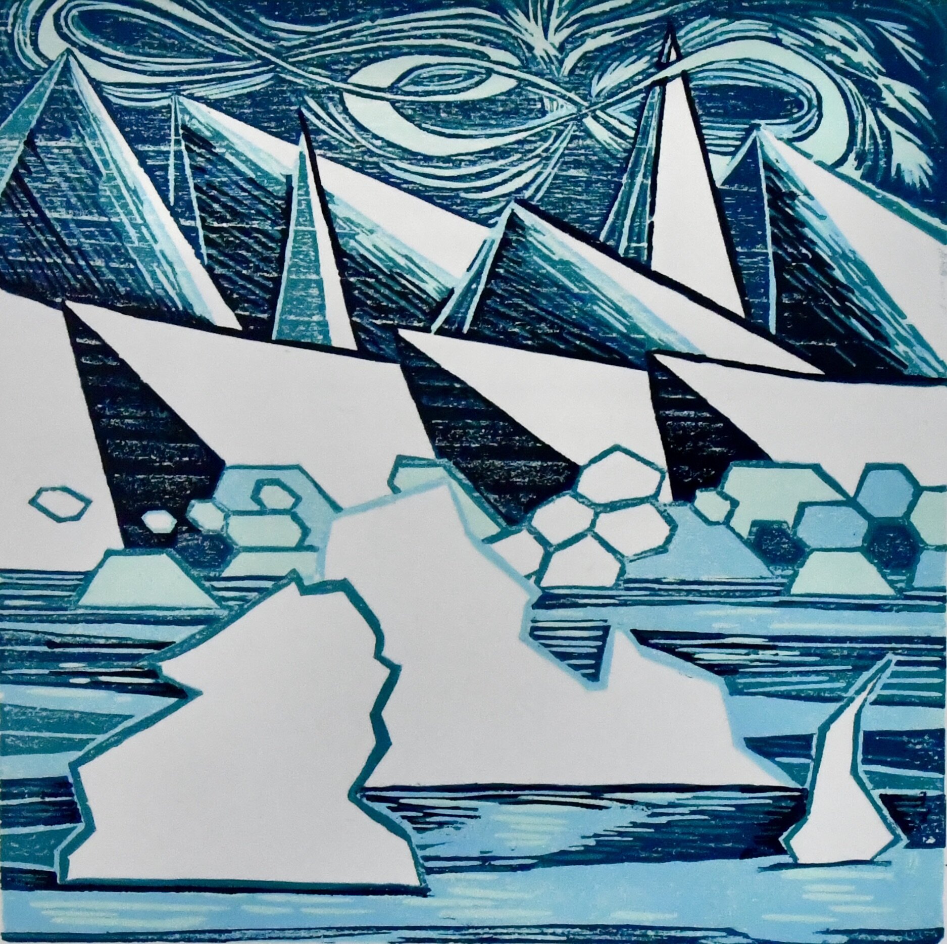
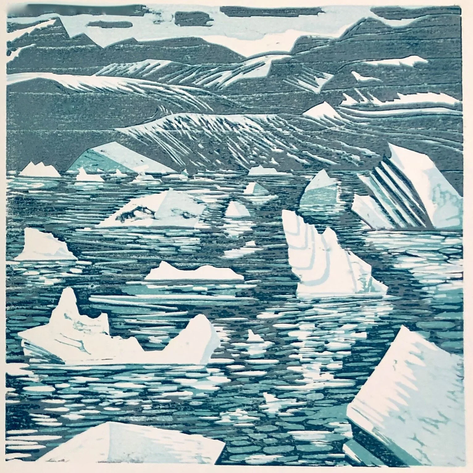
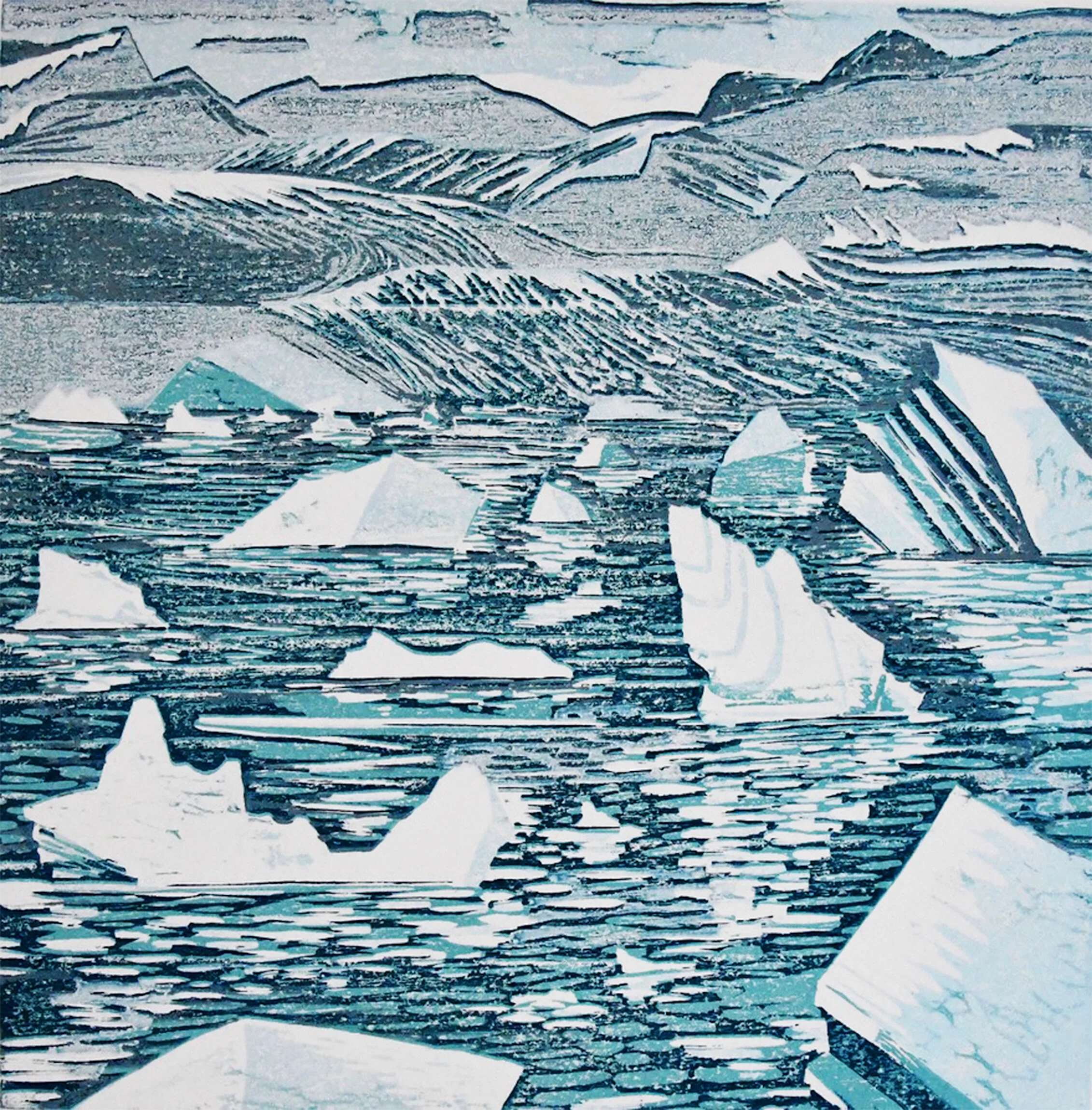
Drift-scape
Drift-scape is a five color reduction woodblock print concerning the voice of the Arctic’s changing landscape and the vague understanding of her message.
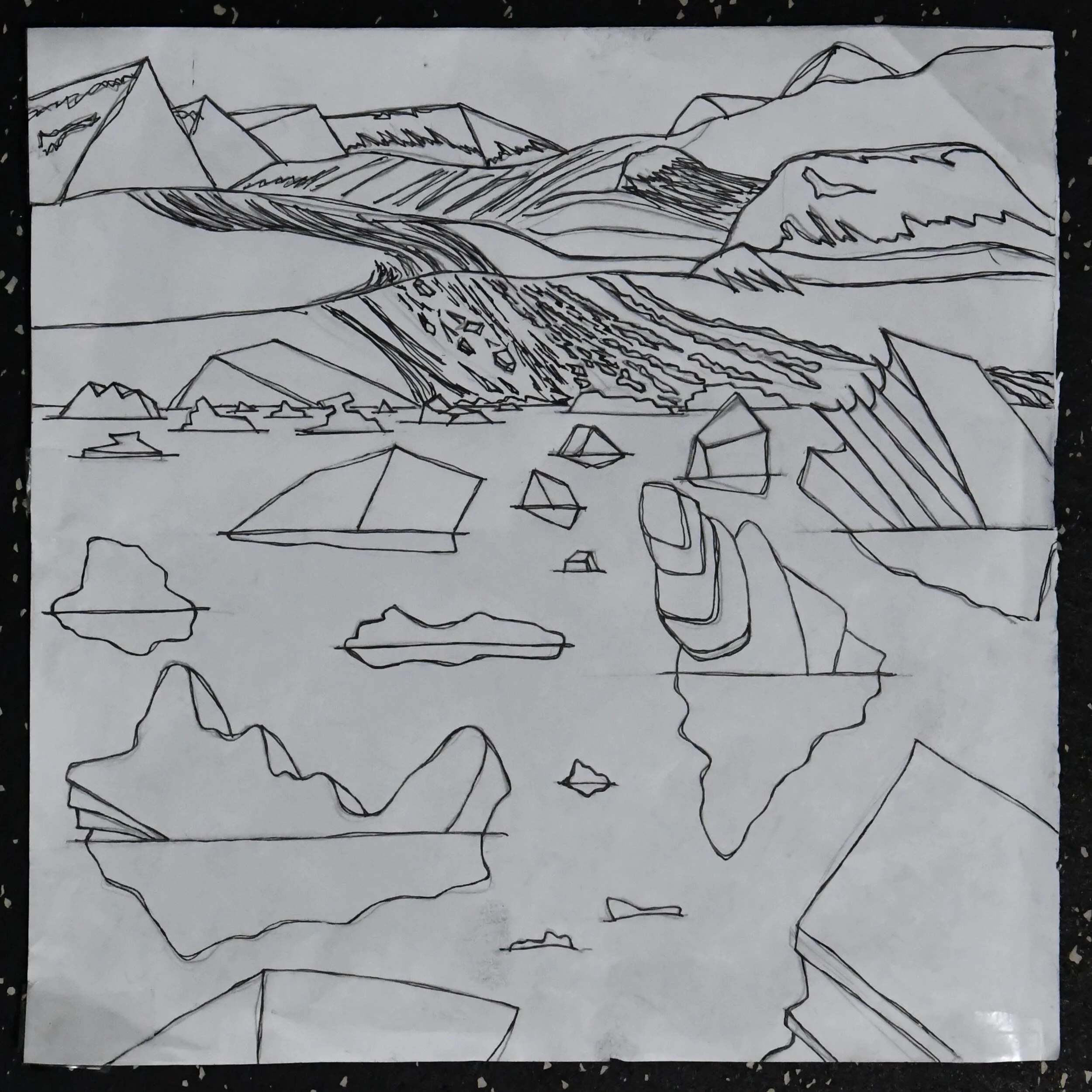
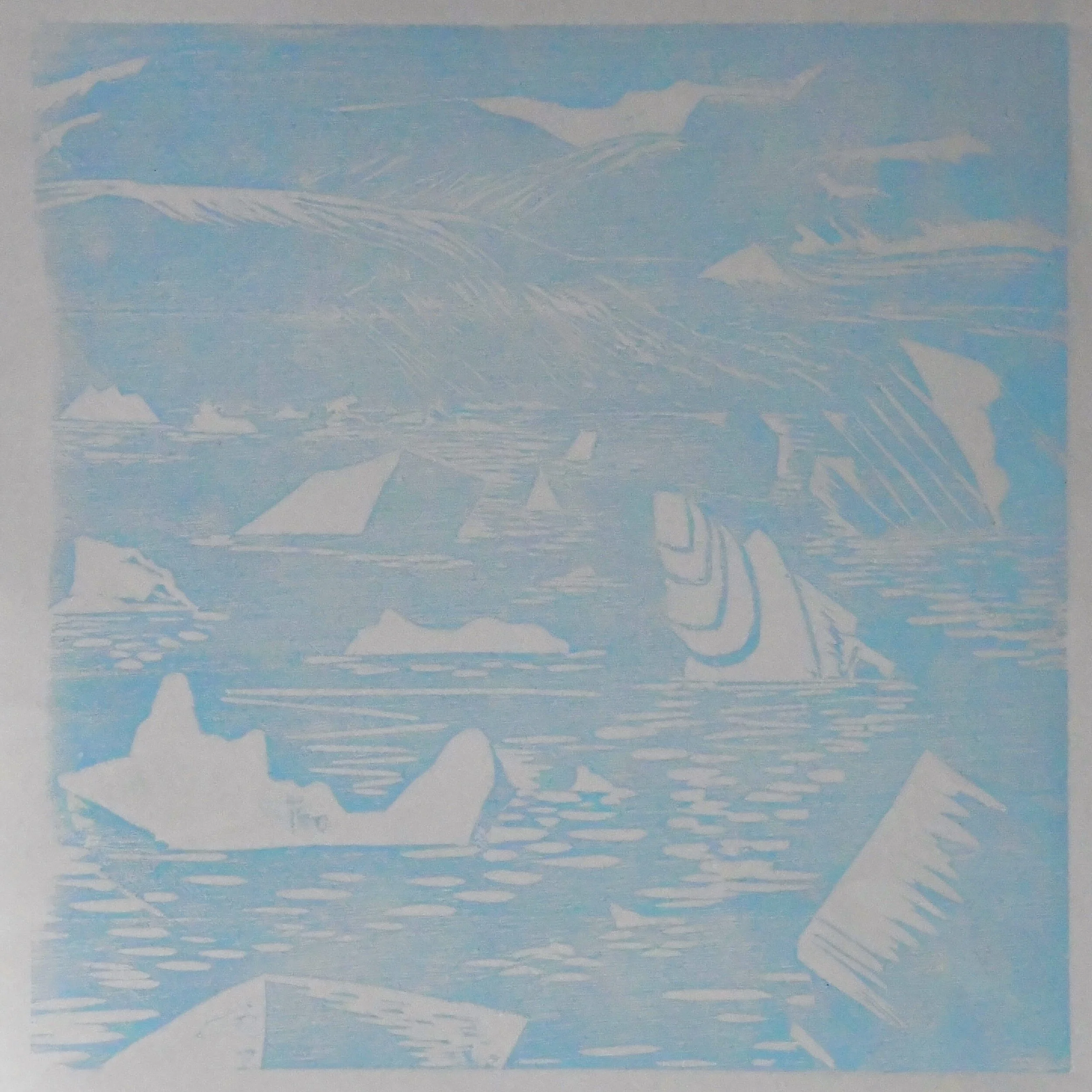
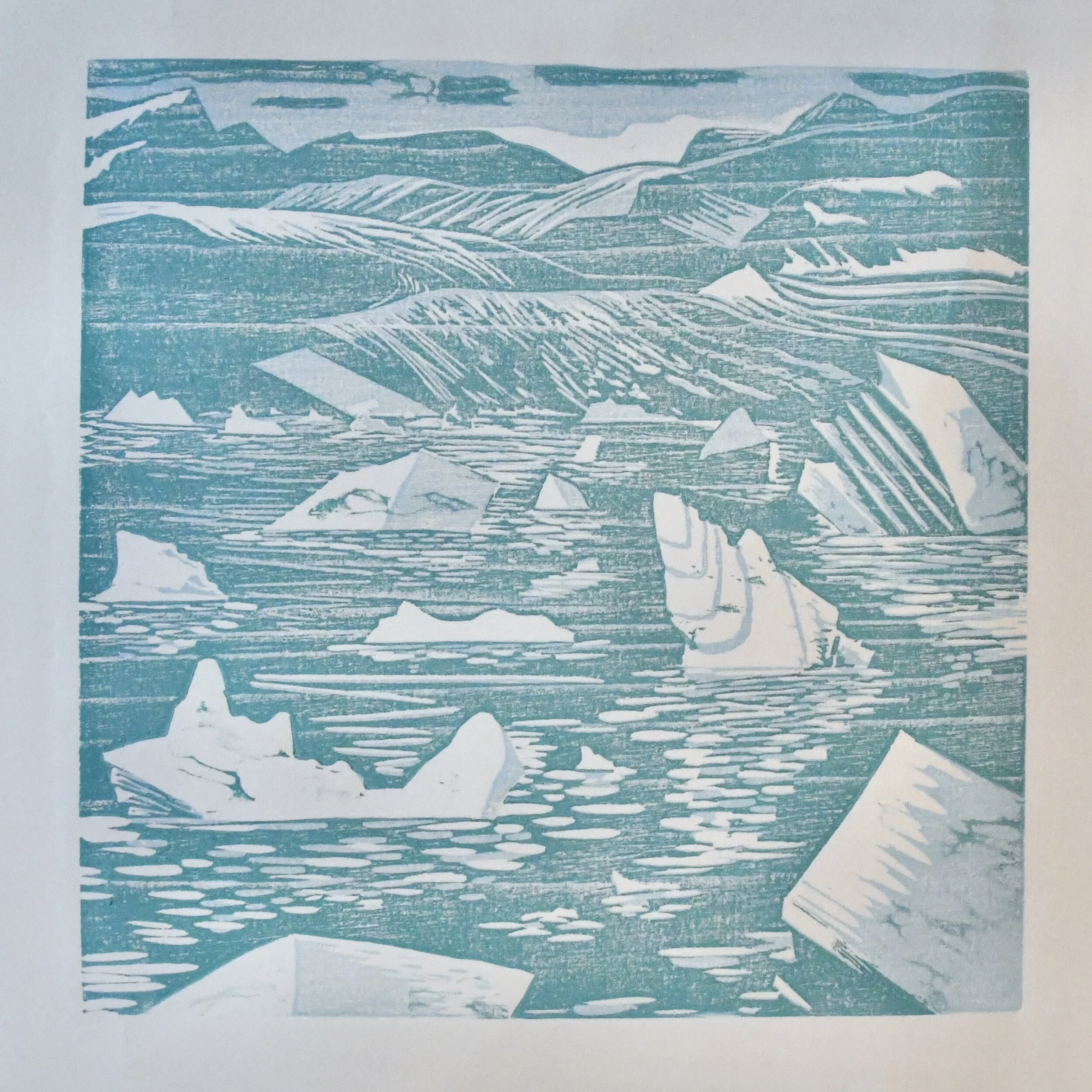
Progressive layers making up Drift-scape (below)
Process video from start to finish highlighting layering techniques used in this print. (below)
View in full screen for reading captions
Music: Transition by Audionautix is licensed under a Creative Commons Attribution license (http...
Shattered Glass at BDAC

After participating in occasional exhibitions at Blue Door Art Center over the course of the past few years, I am happy to join the Blue Door Artist Association. Currently on exhibit are four of my paintings and one of my large reduction woodcuts at their glassworks exhibit, Shattered.
Weather Report at MAG
Weather was certainly a theme this weekend as temps almost reached 70, Weather Report had its opening reception at Mamaroneck Artist Guild (MAG).
In the show my large woodcut Glase Waves had its debut centered up high on the gallery walls, while also representing the show in MAG’s marketing materials. As one of their new members, it was exciting to have that honor.
Glase Waves is a 30x42” four color reduction woodcut print and was created with two others Stratatella and Calving. More on this can be read here on a previous post ‘Contemporary Abstract Icescapes’.
The work in the show ranges from prints, paintings, sculpture, photography, weavings, to wearable art such as jewelry and scarves. If you’re in the area it is absolutely worth checking out soon. Weather Report runs from January 8-25th, 2020.


Decade Kickoff
Proud new member of the Mamaroneck Artist Guild (MAG) where I have already had a successful showing and selling of several works at their end of year Holiday Boutique show ‘A Gift of Art’.
The talent at MAG is exciting and impressive. While browsing the gallery it is difficult not to purchase the work myself! I’m very happy to be a part of it and even more looking forward to getting to know more about the other artist members and their work.
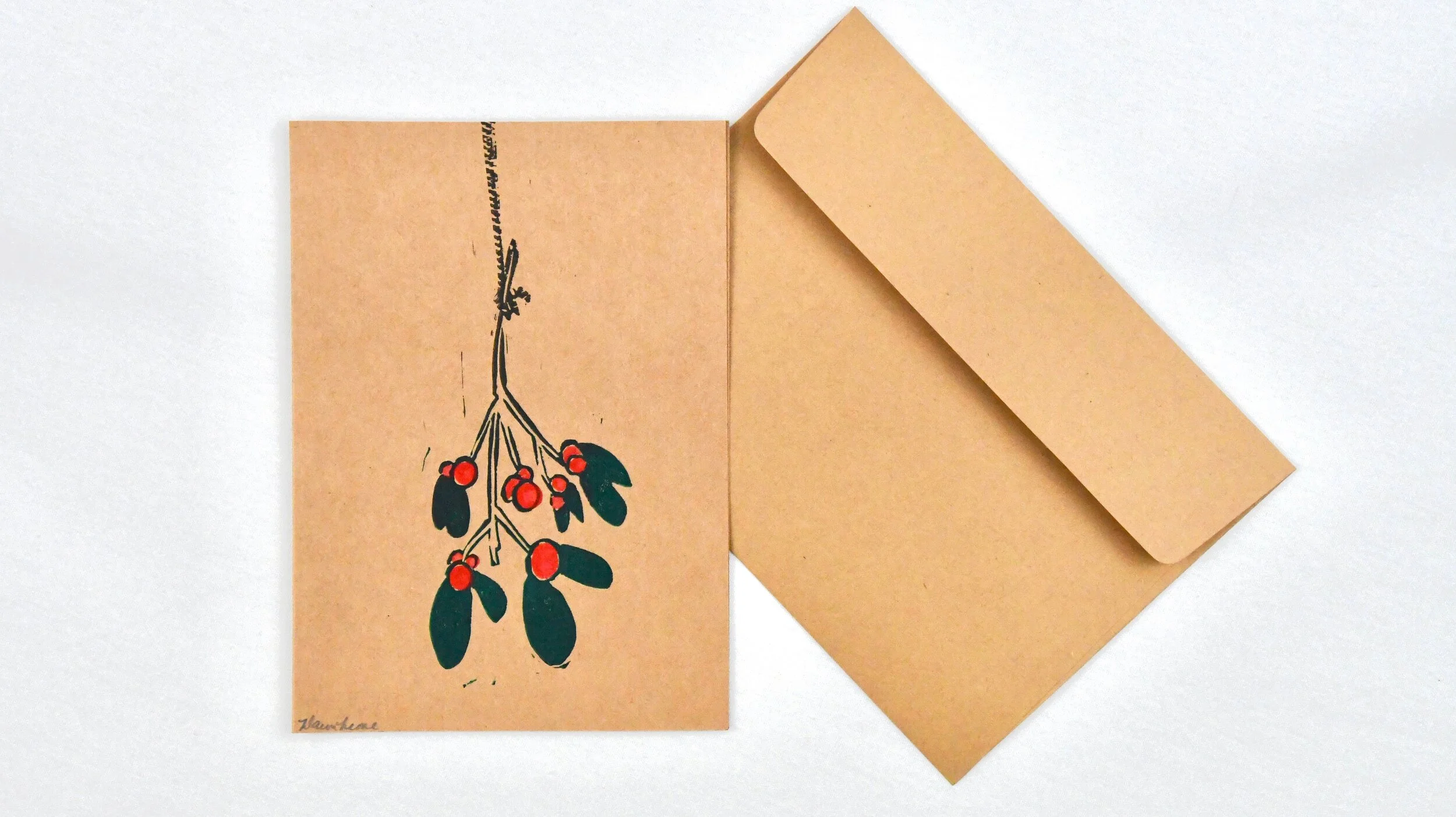
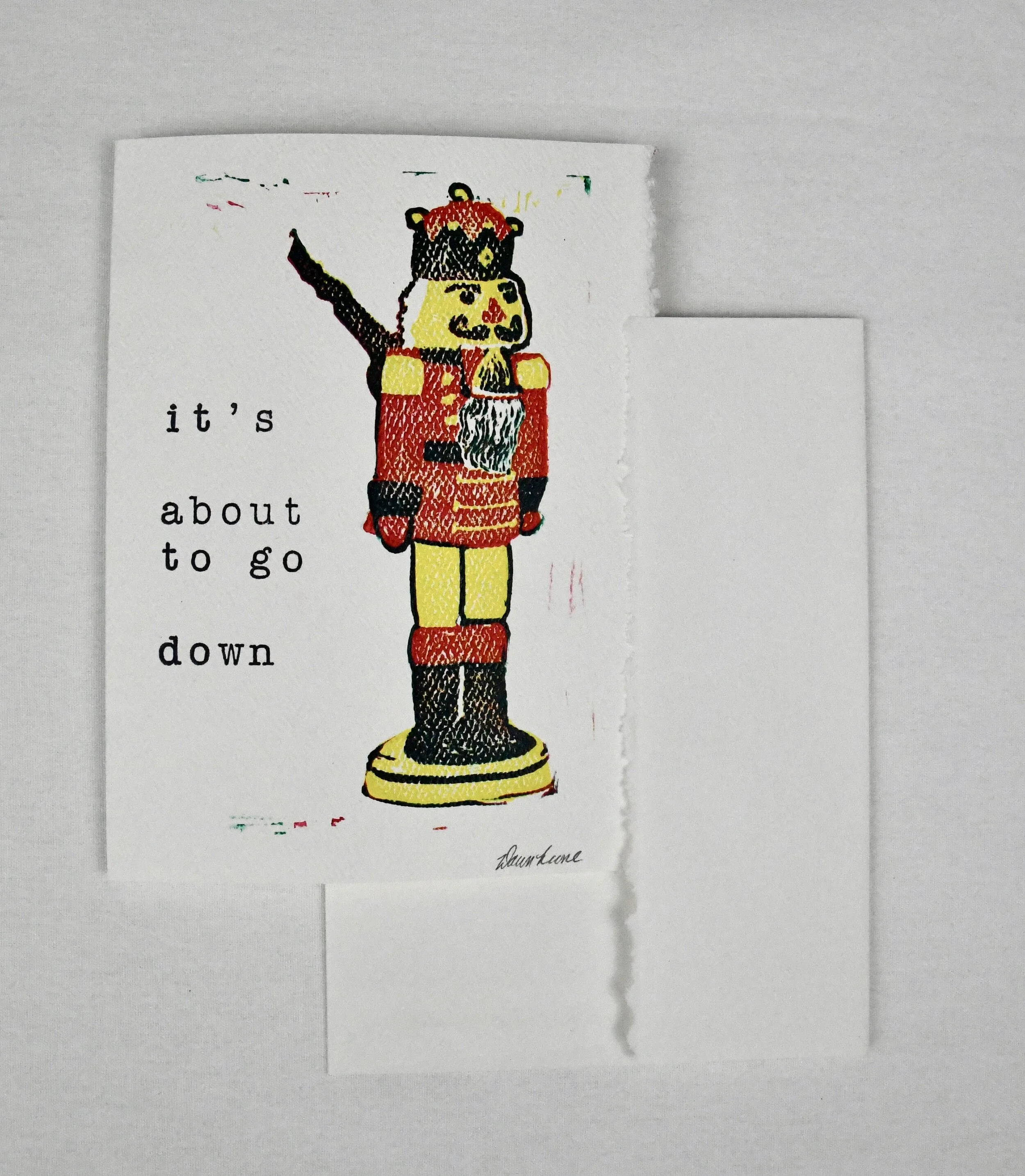
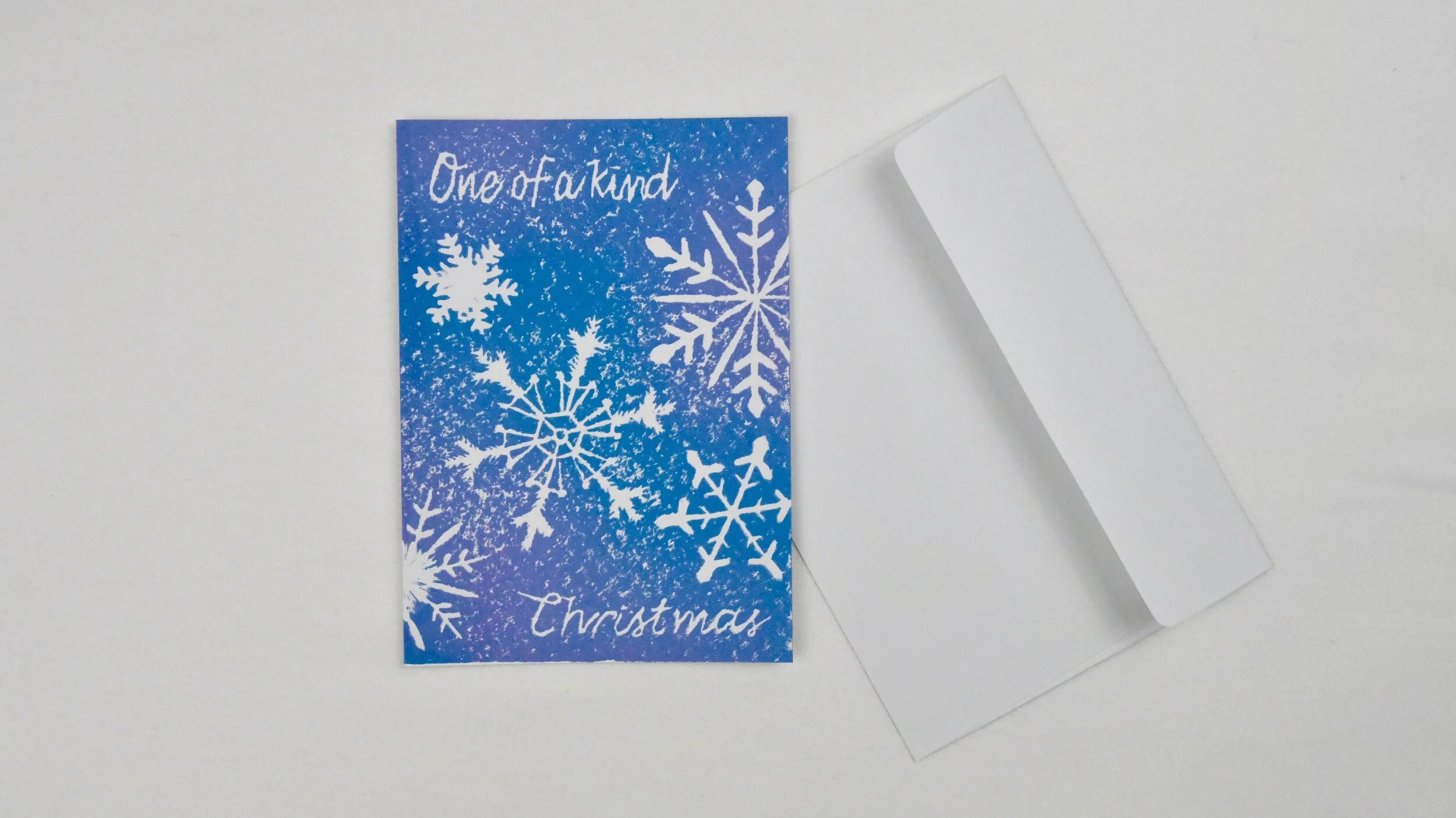
my top three holiday cards of 2019. click to slide the carousel.

Arts Westchester
It is a wonderful feeling being awarded an ArtsWestchester grant for my proposed project titled ‘We Are Mount Vernon’- a portraiture project focusing on the residents of Mount Vernon.
Being from Mount Vernon, a place where both my parents and extended family grew up makes this project especially meaningful to me.
I hope that this project brings people together, gets residents talking about art and the importance of art in their city.
Icebergs
An underpainting of lush green landscapes mirrors earth’s climate cycles.
A tilted axis perspective of forms floating
Orienting zero latitude.
A sloping downward diagonal, like slowly pouring out a glass of refreshing icy spring water
Floating with the waterline, light plunges into ocean’s depth revealing
Iceberg majority.
Icebergs, oil on canvas, 30”x30”
Contemporary Abstracted Icescapes
StrataTella, Calving, and GlaceWaves are 30”x42” reduction woodcut prints. These large scale prints were pressed from hand carved pine and hand pressed in a three & four-color process. Each print was uniquely designed to incorporate the pine blocks naturally occurring knots and was carved along the wood-grain to allow the texture to speak through, forming a relationship between the matrix natural makeup and the icescape composition.
for more information about glacier ice, check out one of my favorite fact checking sites https://nsidc.org.
Glace Waves (30”x42”) is a four-color reduction woodcut exploring the textural and tonal varieties of glacier ice. The reduction process in this giant block print employs the matrix to visually speak via woodgrain and symbolically represent the many ways nature records and reports earth’s history. Giant icebergs once belonging to Iceland’s Breidamerkurjokull glacier float along the Jokulsarlon Glacier Lagoon, gradually melting to become one with the sea. The ice melts from the bottom into the lagoon’s lake, making them top-heavy and literally flipping themselves over. As icebergs melt, flip, and rotate they also morph into unexpected shapes. The colors and textures of all this frozen water are not only beautiful but have meaning. They tell a story of climate. The different ratios of oxygen trapped in the ice explain how fast the water froze and how compressed the hydrogen was compared to oxygen. The whiter the ice, the more oxygen is present. I studied the white, blue, and green variations. Light bouncing between glaciers, the sky, and reflecting from the lagoon creating visually mesmerizing effects of color.
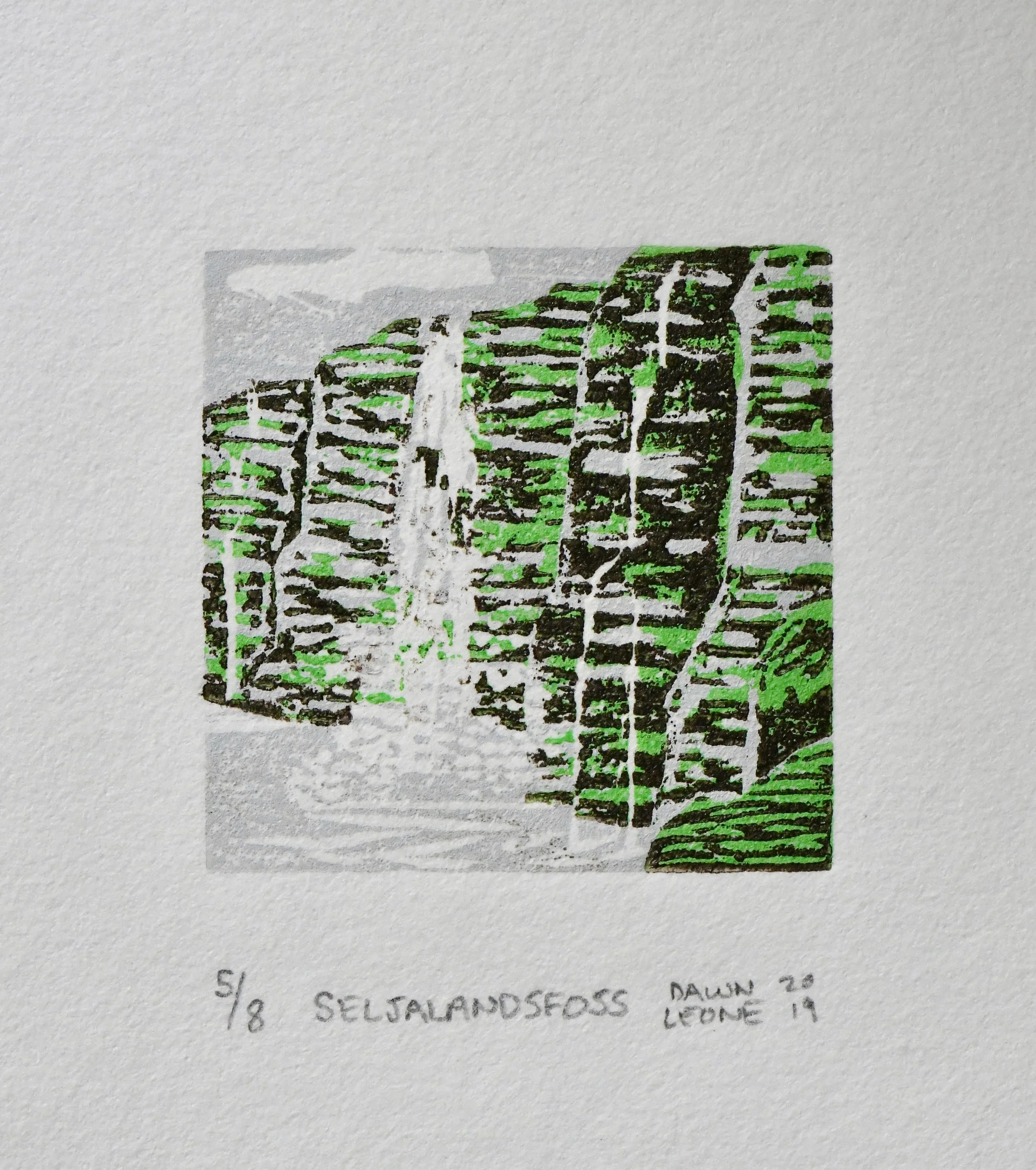
‘StrataTella’ is a three-color reduction woodcut that centers on the horizontal layers of glacial elements melting into the sea.
The melt travels downward carving crevices into solid ice. As it re-freezes the melted carved area solidifies. This process creates a varied zigzag checkered pattern. Melting ice has created a deep cavern and its depth is portrayed through dark layers of ink against white speckled droplets of melted ice water. Layers of deposited ice and sediment seem to slowly collapse. In the distance, the landscape once covered by glacial ice reveals sediment layers deposited by drifting ice. Sky, land, ice, and sea collectively stack themselves into a relationship of color, pattern, formation, and causality.
‘Calving’ is a four-color reduction woodcut named after the event where glacial mass crashes into seawater, calving.
The composition is on a tilted axis altering the perspective of the viewer, with a shifting narrative of shape and color.
Positive and negative spaces collaborate to create ice, waves, and swells from a calving event- leaving behind its former landmass in the distance.
JUMBO PRINTS
As the ink dries on my newest three woodcut designs, a new video gives a glimpse of the works and process.
Memorabilia Print on Stretched Linen
Printing with found objects
I was handed gorgeous antique keys and asked to make something with them. The keys belonged to a family/friend who recently passed. His son gathered them as he cleaned out his father’s home. I was honored to be trusted with these sentimental items.
That being said, yes the paint comes off metal. Immediately after finishing the painting process they were rinsed then soaked in soapy water. The patina did not change and they look the same as they did before. Take a look at the How-to video of Antique Key Print.

Supplies:
Fabric to print on – cotton, muslin, unprimed canvas, linen
Objects to print with (ie antique keys)
Hammer or mallet (for pin stretcher bar pins- optional)
Flat headed screwdriver
Pliers
Pencil with eraser
Scissor
Scrap cardboard to make a tracing shape template -used cereal boxes are easy to cut
Towels for padding – old, but clean. They will likely get paint on them
Measuring tool- for centering
Paintbrushes – one for applying paint to object, and another fine brush for personalizing or signing the work
Disposable paper plate or cup- for paint
Staple gun & Staples
Iron
Here are a few tips for making this a success
Prepping the support:
The stretcher bars kit comes with directions if needed. Using a hammer to push in the pins is optional; they can be pushed in by hand.
The Sketch:
When drawing on the fabric, draw very lightly. The pencil does erase, but may create pilling, or fabric fuzz. That can make the final piece look messy. A fabric shaver helps fix that.
The arrangement:
Pre-plan the arrangement of objects within the shape. Otherwise the design could come out uneven or with empty spaces. If there are empty spaces try printing half of the object to fit the space. This tip worked for a few areas in the video.
Printing:
Applying paint is a messy job. Make sure to wash and wipe hands between each key print to avoid smudges and unwanted marks. Avoid working over the project- paint drips. Once the paint is on the fabric, don’t try to wipe it off. It is easier to start over than to clean a mistake. Make sure paint is 100% dry before moving onto the next steps.
Stretching the Fabric onto Stretcher Bars:
Before fixing the fabric to the frame, iron out creases. If your fabric looks too transparent on the support frame, double up the fabric by adding a layer behind the design as seen in the video. Making sure the design is centered on the frame is crucial. Measure, re-measure, then measure by eye. Start stapling one side at a time with few staples in case adjustments need to be made. Staples come out with a flat-head screwdriver and pliers. Pull the fabric taut and evenly. Pulling too hard or unevenly will cause the design to distort.
There are a lot of steps, but is a fun and straightforward DIY project.
Sea Glass, Oil on canvas 16"x20"
Joining the Glacier series is ‘Sea Glass’. An oil painting on canvas. Much like my previous glacier painting ‘Jokulsarlon’ this painting is an icescape, or a landscape of only ice (backstory of why I am so interested in glacier paintings).
‘Sea Glass’ was created to be a color study of observed variations of light reflected, refracted, and absorbed in the glacier lagoon. I also wanted to create a more abstract version focusing on color effects and movement rather than form, perspective, and depth as in ‘Jolulsarlon’. The viewer’s eye is brought down in a downward diagonal than brought back up by the whiter glacier in the foreground creating a counter clockwise eye movement much in the direction of how the glaciers are melting. Downward. While creating the painting, I decided to title it ‘Sea Glass’ because of the similarities in appearance. More about the process is in the video.

style points- I painted this with a dislocated shoulder and broken arm
Mini-print March Madness and the Jury is out
Overjoyed to not only be accepted into the ‘12th Biennial International Miniature Print Exhibition 2019’ at The Center for Contemporary Printmaking, but to also receive the McClain’s Printmaking award.
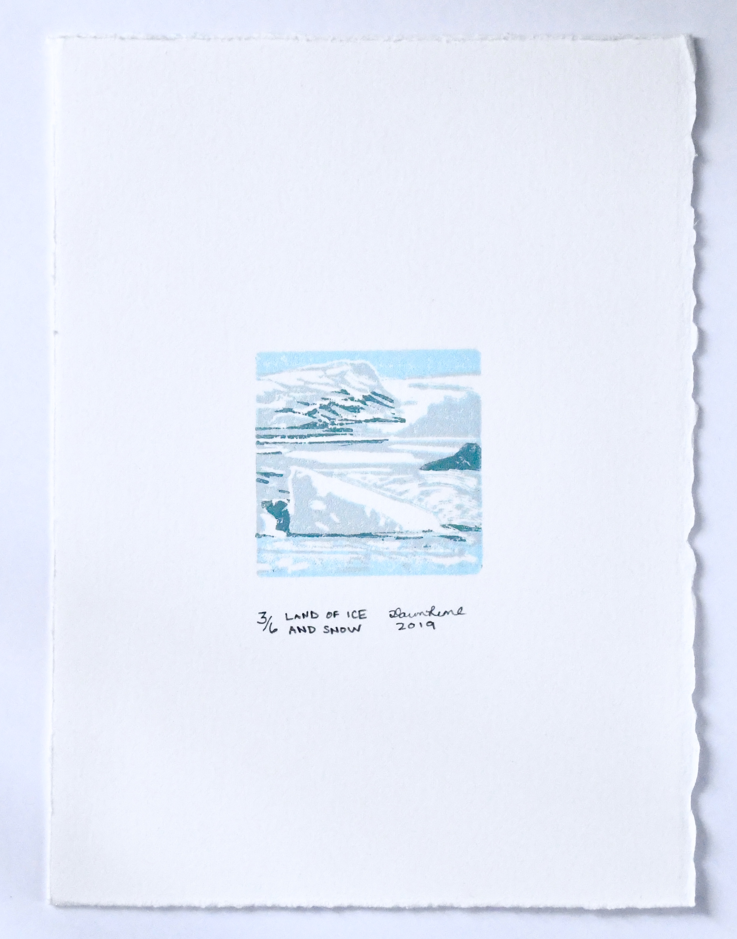
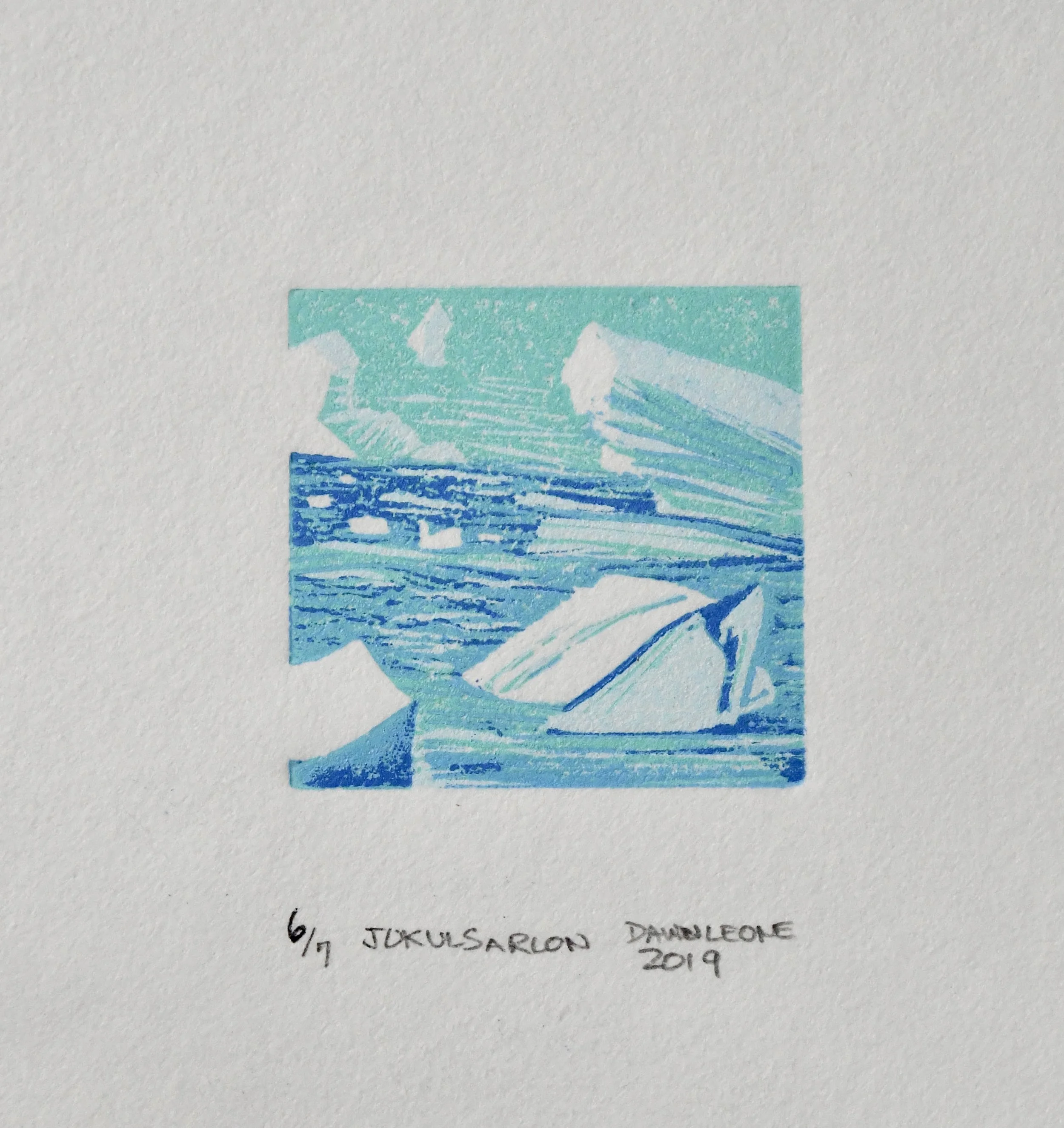
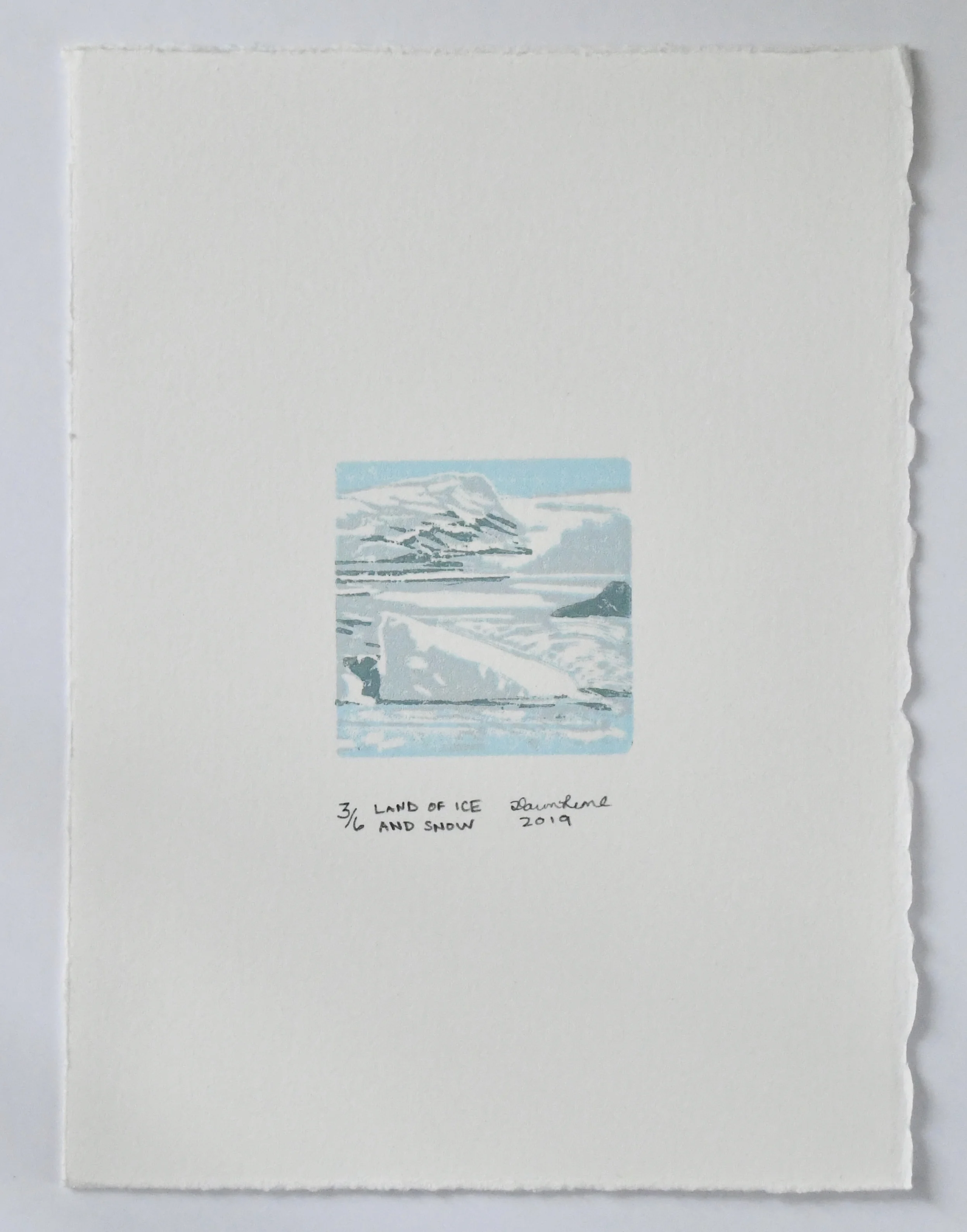
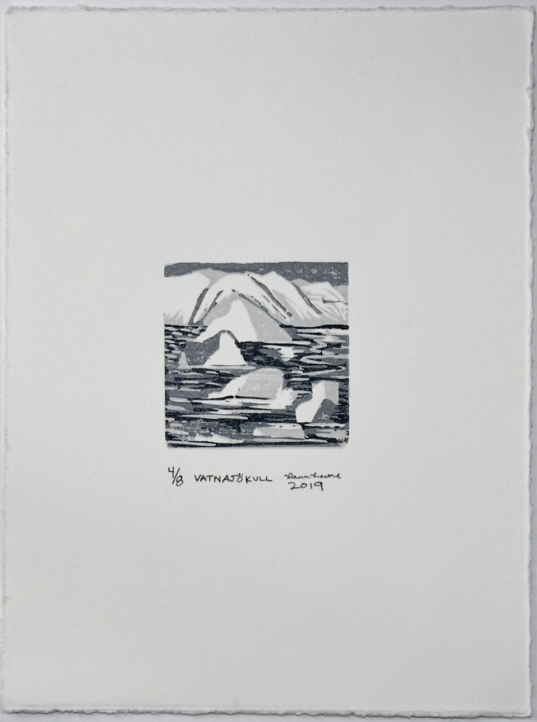
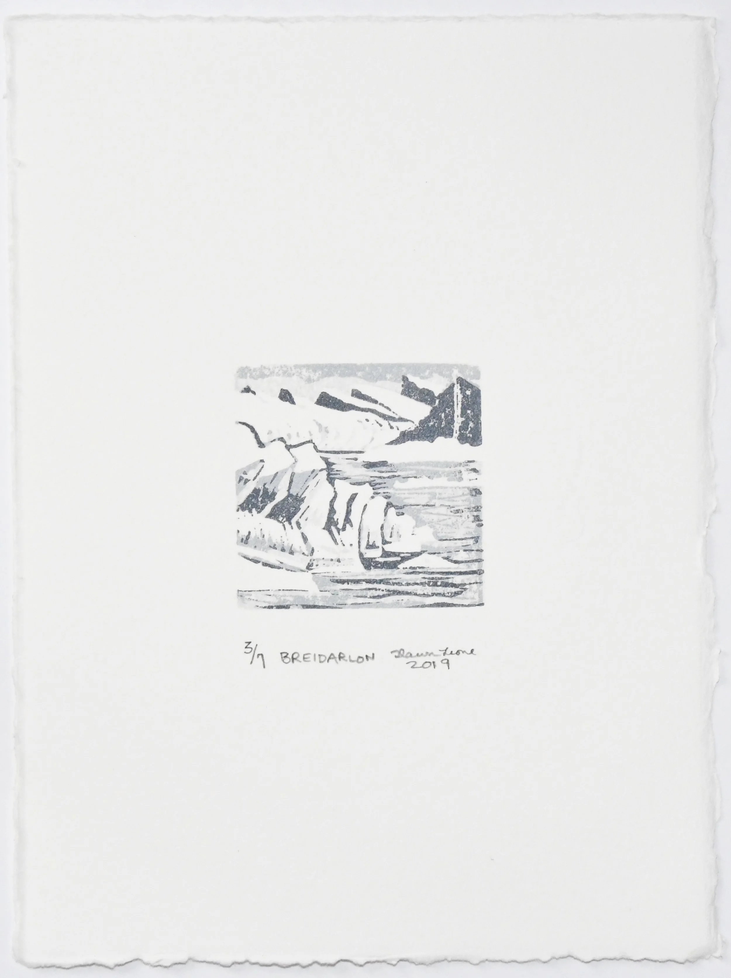
After reviewing 468 prints submitted by 158 artists from 26 countries and 20 states, Artist & distinguished Juror Tomas Vu-Danielselected three of my prints; Jokulsarlon, Breidarlon, and Land of Ice and Snow.
My ‘Jokulsarlon’ print was chosen for the McClain’s Printmaking Award, which is a purchase award. Jokulsarlon will become part of the McClain’s Printmaking collection following the show.
After the CCP’s exhibition, the show will travel to the Bendheim Gallery aka The Greenwich Arts Council, also located in Conneticut.
Check the video below and links above for dates and details.


Miniature Print Challenge
I don’t always participate in art calls, but when I do it’s because I have a ton of ideas I need to test out in a compact format.
Plus, having a deadline keeps me in the studio.
*Coming Soon: Mini Prints will be available in the Print Shop
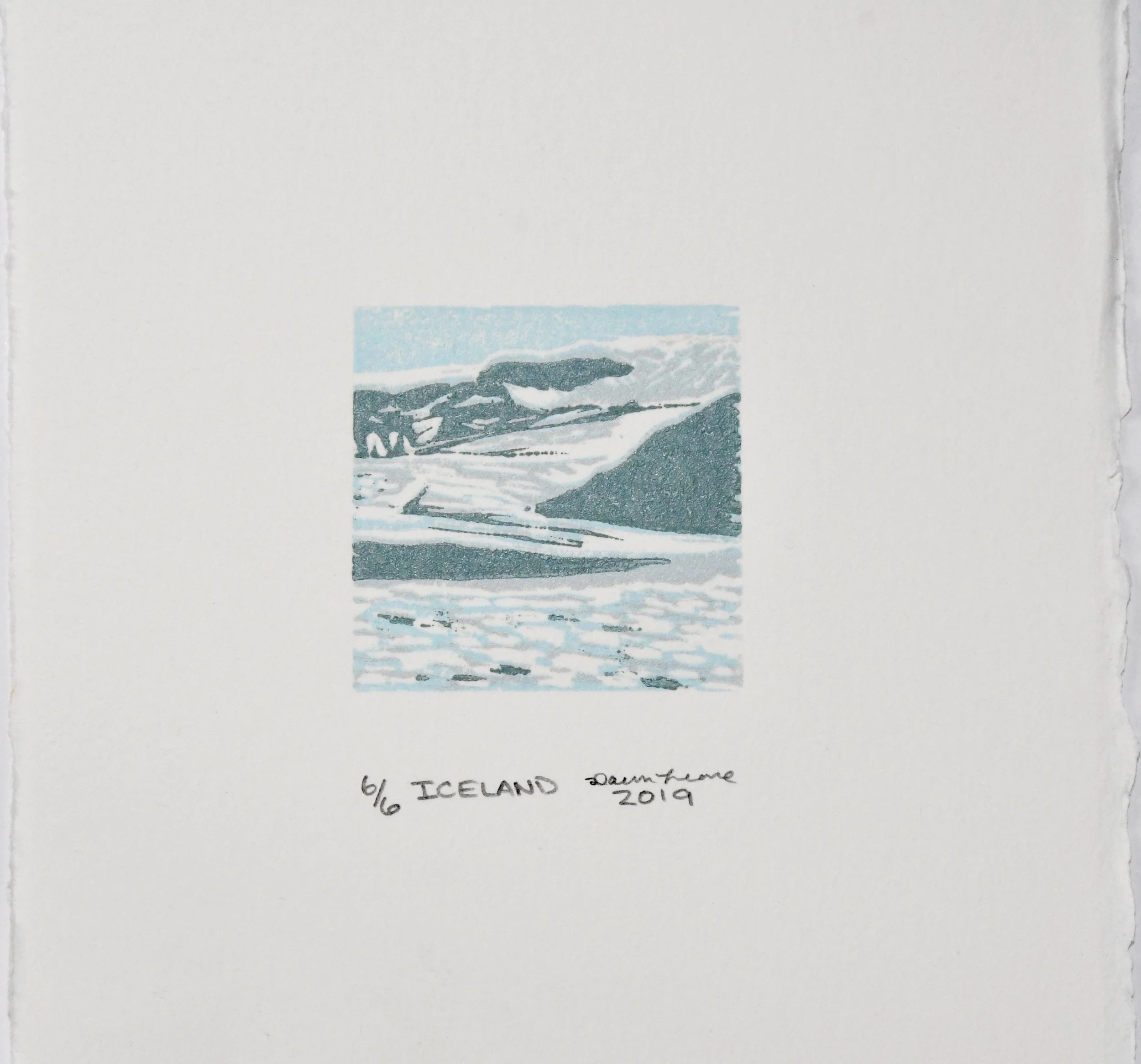
I call this the mini print challenge. Nearby and worldwide galleries call for miniature works to exhibit a greater quantity of art (by scaling down size limitations).
This time around my goal was to create depth in a tiny space. I started out by re-imagining my Jokulsarlon painting and using printmaking as an advantage to be more methodical in my outcome. In this series I further experiment with color and topsy-turvy ice forms. The blocks used are only 4 square inches or 2”x2”. To create a miniature world inside that space was my own personal challenge. To compensate for limited surface material, I kept my layers to a 3 color reduction process and used paper white for more than highlighting. In all I created two dozen 2”x2” mini prints in a course of 12 weeks. Of the dozen, 10 were made into editions.
Now that I have a good amount of ideas tested out, I’m ready to get back into a larger production.
Reduction Linocut Holiday Card
I started production of my annual holiday card series, now available in my Print Shop. What’s new this year is I decided to create a limited edition. Usually I make single process cards, but ever since I’ve started using Turnes-Burton registration clips & pins my prints are so much more fun to make, come out much clearer, and are less disappointing. I also found another way to incorporate text into my prints without carving text into the block in reverse (link below). For this project I didn’t like how ‘free hand’ it looked when caving text into the block, so I either had to find another way or leave the text out completely. So glad I found these.
Ice-Scape. Art-Lapse.
Jokulsarlon, oil on canvas 20”x 24”
Inspiration
A recent trip to the island of fire & ice brought me to an unforgettable lagoon of floating glaciers, Jokulsarlon Glacier Lagoon. Here giant ice once belonging to the Breidamerkurjokull glacier float along melting becoming one with the sea. I spent a lot of time observing, photographing, and kayaking in between these glaciers. Some glaciers melt from the bottom into the lagoon’s lake and when the bottoms melt away they become top-heavy, literally flipping themselves over. It’s unbelievable to see something so inanimate seem so alive.
As ice melts, flips, and rotate they also morph into unexpected shapes. The colors and textures of all this frozen water are not only beautiful, but have meaning. They tell a story of climate. The different ratios of oxygen trapped in the ice explain how fast the water froze and how compressed the hydrogen was compared to oxygen. The whiter the ice, the more oxygen is present. I studied the white, blue, and green variations. Light was bouncing between glaciers, the sky, and reflecting from the lagoon itself creating visually mesmerizing effects of color. I was excited to try and capture a piece of what I was experiencing in this painting.
Process
It is easy to get lost in a composition of abstract shapes such as ice. I decided to set my ice forms in space with a rough draft the applied perspective techniques for depth. Once the glaciers were formed, I distorted them here and there to imply the topsy-turvy nature of the glaciers. I think this really helped create the illusion of glacier movement in calm water. Once I was ready for color I decided to use a limited palette to prevent colors from getting to heavy or muddy. I wanted to keep the painting as bright and light as possible. I kept it simple with titanium white, cerulean blue, viridian, and cadmium red. As I played with color I dedicated a custom color to each glacier, then used cadmium red as its opposite for shadow. Titanium was for highlights.
Art Goals
I always create a challenge for myself in my paintings. For this painting the objective was to capture the topsy-turvy yet hefty glaciers, their abstract-organic forms, and the unique light they absorb & reflect. As I worked on this painting I realized the actual challenge was making the glaciers look heavy but also like they are floating without loosing too much detail or overly distorting their forms (from perspective & foreshortening). This is where I took a few artistic liberties for the sake of my desired outcome. According to time-lapse, I created this painting in less than five minuets with a few outfit changes in between, however in real life it took about a week from sketch to signature. I had to stop myself from getting lost in the blues and greens and put the paintbrush down. Sometimes knowing when to stop is key. I have these glaciers right where I want them, but I have a feeling there will be more Jokulsarlon paintings to come.